
Color is one of the most powerful tools in interior design. It shapes not only how your home looks, but how it feels to live in it.
The right color combination can make a space feel calm, warm and inviting — while the wrong mix can create tension, restlessness or even subtle discomfort.
In well-designed interiors, colors don’t compete. They support each other, creating a natural flow that feels effortless and harmonious. You might not always notice it consciously — but you feel it immediately when you enter the room.
In this guide, you’ll learn:
- how to combine colors in interior design
- which color palettes work best in real homes
- how to avoid the most common color mistakes
- and how small changes can completely transform your space
Whether you prefer soft neutral tones or bold, expressive colors, the key is understanding balance. Once you see how colors interact, designing a beautiful home becomes much easier — and much more intuitive.
How Colors Affect Mood and Space
Calming bedroom with soft teal and warm neutral tones
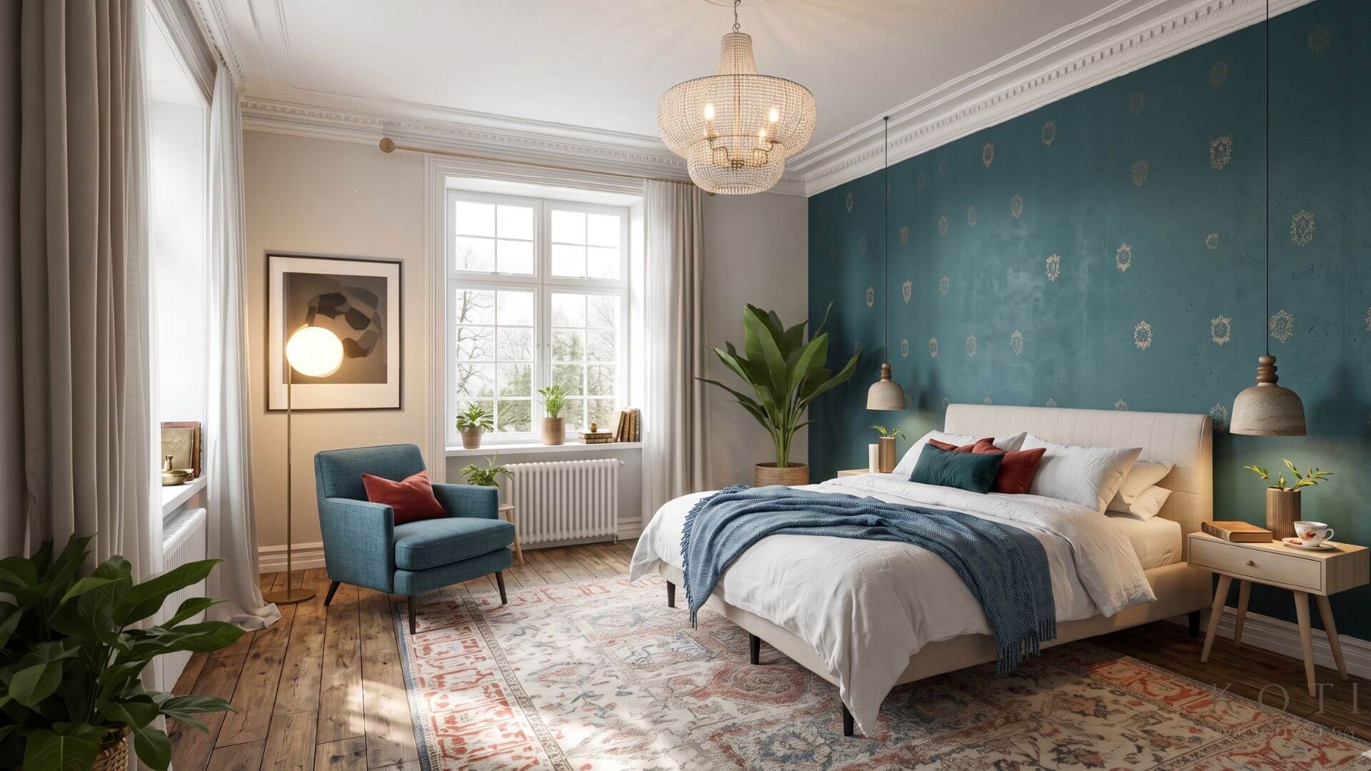
Colors don’t just define how a room looks — they shape how it feels to spend time in it.
Every shade carries a subtle emotional effect. Some colors energize and stimulate, while others calm the mind and create a sense of balance. This is why the same room can feel completely different depending on the color palette.
In interior design, colors are often grouped into three main categories:
Warm colors
- Yellow, orange, and red tones
- Create a sense of warmth, energy, and activity
- Work well in social spaces like living rooms and kitchens
Cool colors
- Blue, green, and violet tones
- Calm the mind and support relaxation
- Ideal for bedrooms, reading areas, and workspaces
Neutral tones
- White, beige, gray, and soft earth tones
- Bring balance and allow the space to “breathe”
- Act as a foundation for stronger accent colors
Practical examples in real homes
 Blue helps reduce stress and improves focus → perfect for bedrooms and home offices
 Red adds warmth and intensity → best used in small accents like cushions or art
 Yellow brings light and positivity → works beautifully in moderation
 Green connects the space to nature → one of the easiest colors to live with
When colors are chosen thoughtfully, they create a space that feels natural and comfortable to be in. But when too many strong tones compete, the result can feel overwhelming — even if each color is beautiful on its own.
 The key is not choosing “the right color” but choosing colors that work together
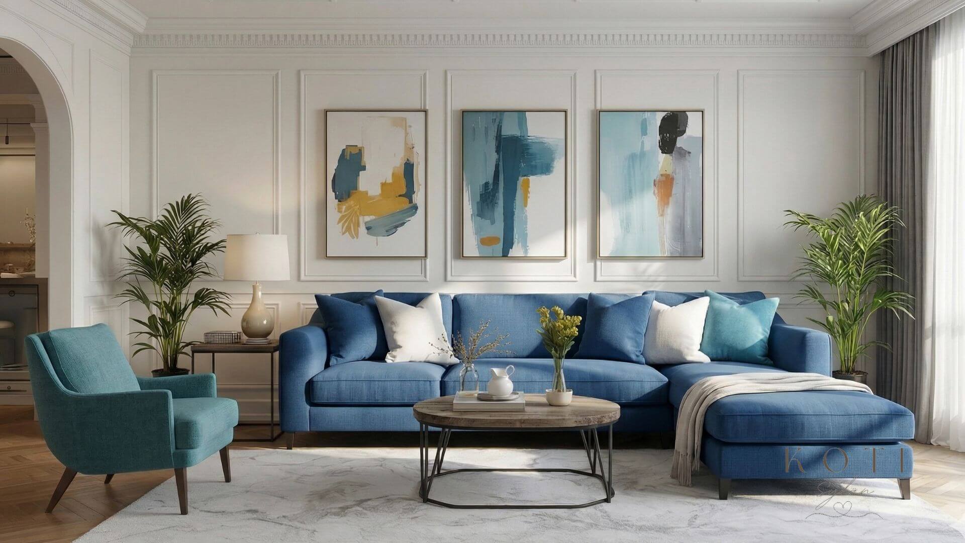
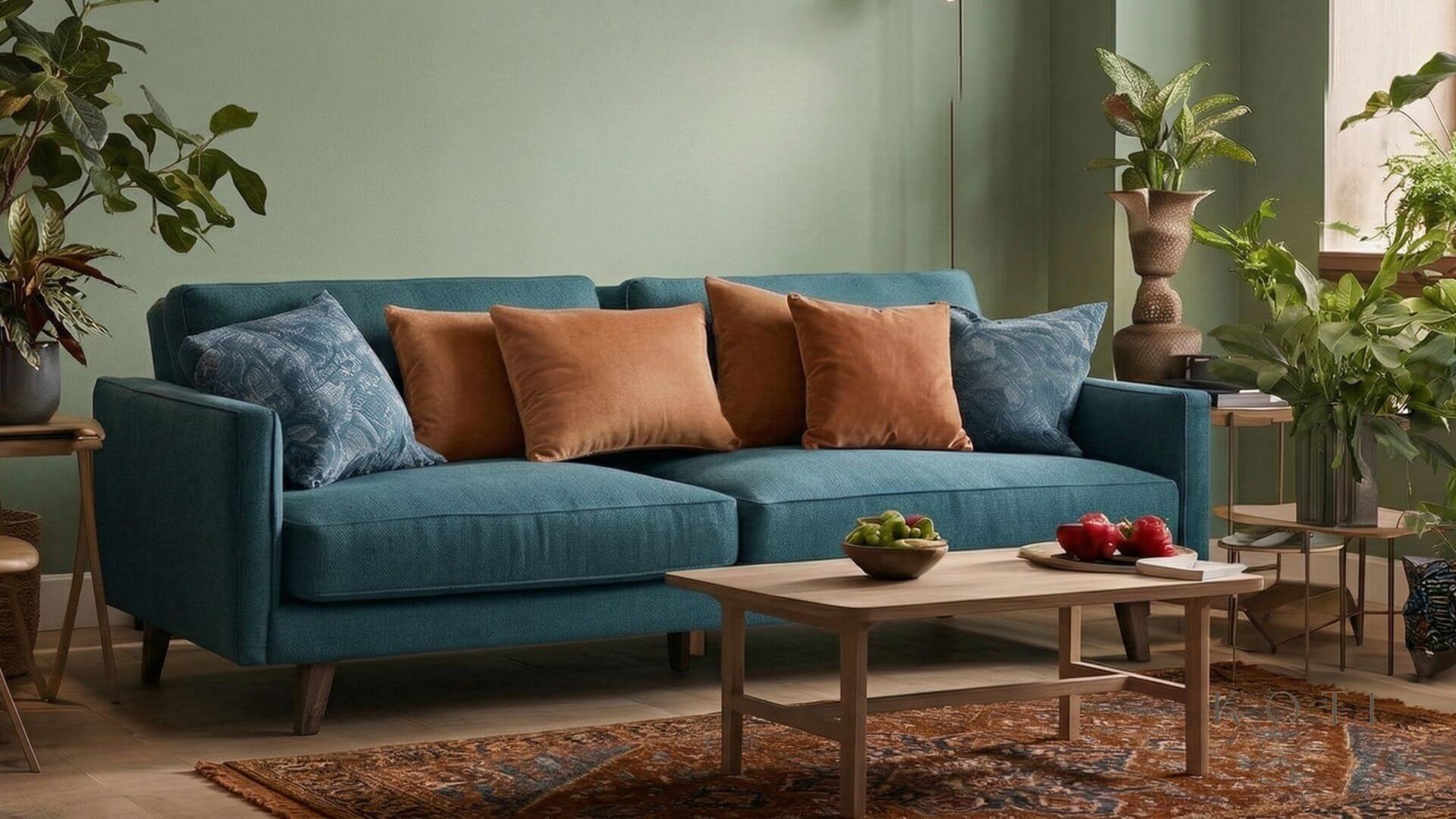
Colors That Work Together – Balance Through Contrast
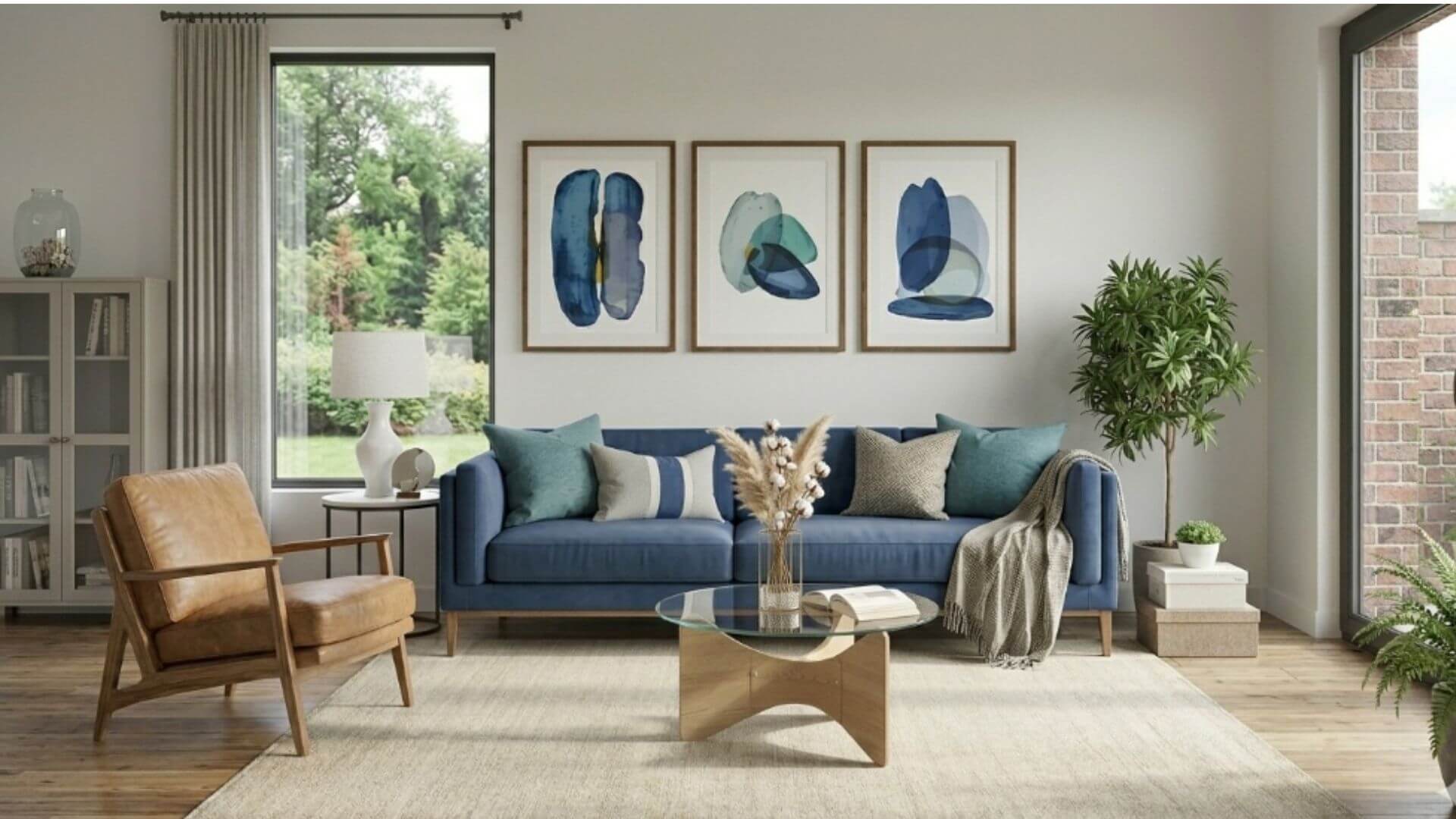
Not all beautiful interiors are built on soft, neutral tones.
Some of the most balanced and inviting spaces are created through contrast — when cool and warm colors meet in the right proportion.
In this living room, the combination of a deep blue sofa and warm brown tones creates a space that feels both calm and welcoming at the same time.
Blue naturally brings a sense of clarity and calmness. It visually cools down the space and creates a stable foundation. On the other hand, warm cognac tones — seen in the armchair and wooden elements — introduce warmth, softness, and a lived-in feeling.
What makes this combination work is not just the colors themselves, but how they are used together. Neither tone dominates too strongly. Instead, they balance each other in a way that feels natural and effortless.
Why this contrast feels so good
This pairing is based on a classic principle in interior design:
combining cool and warm tones to create balance.
When done right, contrast doesn’t feel sharp or overwhelming.
It feels dynamic — but still comfortable to live in.
Without the warm tones, the room might feel too cold.
Without the blue, it could feel too heavy.
Together, they create harmony through contrast
How to use this in your own home
If you want to recreate a similar look, keep it simple:
- Choose one dominant color (like a blue sofa)
- Add one warm contrasting tone (such as cognac, wood, or terracotta)
- Keep the background light and neutral
This way, the contrast becomes a feature — not a distraction.
A timeless combination that always works
Blue and warm brown tones are one of the most reliable color combinations in interior design.
They work because they mirror nature:
- blue → sky, water
- brown → earth, wood
That natural connection makes the space feel grounded and easy to live in — even when the contrast is clearly visible.
Neutrals + Accent Colors – Creating Balance
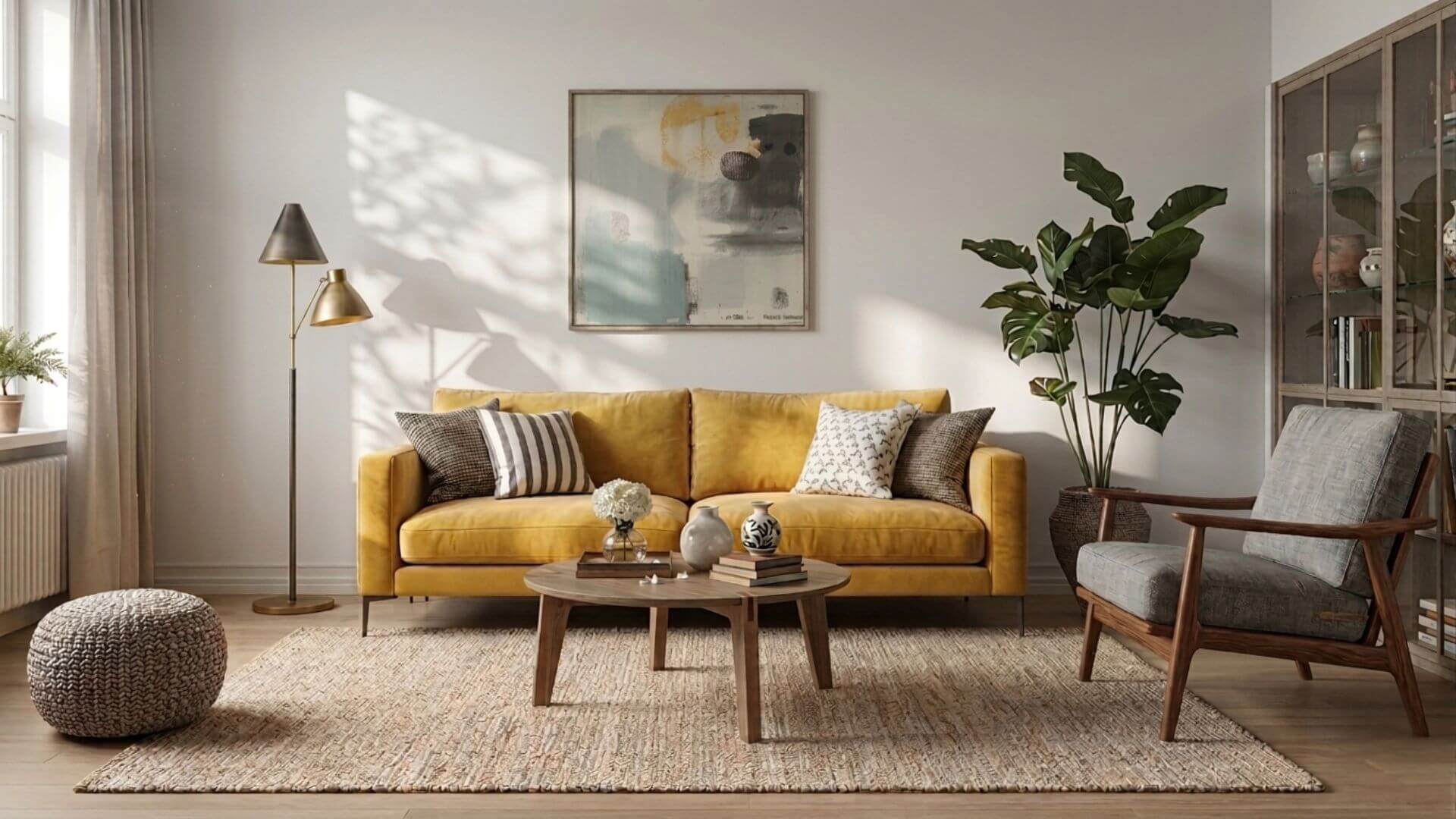
One of the easiest ways to build a visually balanced interior is to start with neutral tones and add a single strong accent color.
In this example, the space is built on soft gray and warm neutral shades, while a yellow sofa becomes the focal point of the room.
Neutrals create a calm and timeless foundation. They allow the eye to rest and make the space feel open and cohesive. The accent color, on the other hand, introduces personality, energy, and visual interest.
What makes this combination work is restraint. The yellow doesn’t dominate the entire space — it is supported by natural materials, soft textures, and subtle tones that keep the overall look grounded.
This creates a space that feels both lively and harmonious at the same time.
Why this approach works so well
Using neutrals with one accent color is one of the most reliable design strategies because it simplifies decision-making.
Instead of trying to combine multiple strong colors, you create structure first — and then add personality.
Too many bold colors can easily compete with each other.
But one carefully chosen accent becomes a clear and intentional design choice.
How to apply this in your home
Start by choosing a neutral base:
- walls, large furniture, rugs
Then introduce one accent color through:
- a sofa
- armchairs
- cushions or artwork
Keep supporting tones soft and natural, so the accent color can stand out without overwhelming the space.
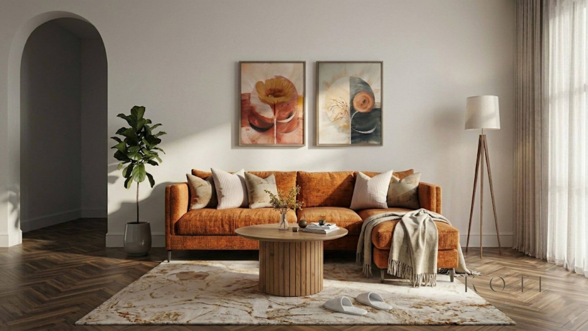
Muted and Earthy Tones – Natural Harmony
Muted and earthy tones are some of the easiest colors to live with.
They create a sense of calm, warmth, and softness — without feeling heavy or dark. These shades are inspired by nature, which is why they tend to work effortlessly together.
In this interior, tones like terracotta, sand, warm beige, and soft brown blend into a natural and cohesive palette.
If you’re looking to bring this same calm and balanced feel into your living room, see these natural color sofas for inspiration.
Nothing feels forced, and nothing stands out too aggressively.
Instead, the space feels grounded and quietly inviting.
Why earthy tones feel so comfortable
These colors work because they are slightly desaturated.
They don’t reflect too much light, and they don’t demand attention.
This creates a soft visual flow, where the eye moves naturally across the room without interruption.
Materials play a key role here:
- linen
- wood
- wool
- woven textures
Together, they add depth without adding visual noise.
A timeless choice for any home
Earthy tones work in almost every room:
- living rooms feel warm and welcoming
- bedrooms feel calm and restful
- dining spaces feel cozy and relaxed
They also adapt easily to seasons — lighter in spring, deeper in autumn — without needing a full redesign.
Analogous Colors – A Soft, Flowing Palette
Some of the most calming interiors don’t rely on contrast at all.
Instead, they are built on colors that naturally belong together.
In this space, shades of blue, teal, and soft green flow into each other almost seamlessly. There are no sharp breaks or strong contrasts — just a gradual shift from one tone to the next.
The effect is subtle, but powerful.
The room feels calm, continuous, and easy to be in.
What this palette looks like in a real home
Instead of a single dominant color, the palette is layered:
- A deeper blue in the sofa creates a stable foundation
- Teal tones appear in textiles and artwork, adding depth
- Softer green shades bring lightness and a natural feel
Nothing stands out too sharply.
And that’s exactly why it works.
The eye moves through the space without interruption The colors feel connected, not separate
Why analogous colors feel so natural
These combinations work because they mirror how colors appear in nature.
Think about:
- the ocean shifting from deep blue to green
- the sky blending into distant landscapes
- leaves reflecting different shades of green and blue
There are no hard edges — only transitions.
That same logic makes interiors feel more relaxed and balanced.
The role of warmth in a cool palette
Even in a cool-toned space, a small amount of warmth makes a big difference.
In this interior, subtle accents — like muted ochre, soft gold, or natural wood — prevent the palette from feeling too cold or distant.
Without these elements, the room could feel flat or overly cool.
With them, it becomes layered and inviting.
How to use this in your own home
If you want to create a similar effect:
Start with a color you naturally like — for example, blue.
Then build around it using nearby shades:
- blue → teal → green
Keep transitions soft, not extreme.
Instead of adding contrast, focus on variation:
- darker and lighter tones
- soft shifts in hue
- different materials reflecting the same color
When this palette works best
Analogous color schemes are especially effective in spaces where you want:
- calmness without emptiness
- color without chaos
- harmony without being boring
They work beautifully in:
- living rooms
- bedrooms
- quiet corners of the home
The feeling it creates
A well-balanced analogous palette doesn’t draw attention to itself.
Instead, it creates a space where everything feels connected — like the colors were always meant to be together.
Not dramatic.
Not loud.
But quietly complete.
Warm Analog Palette – Energy Without Chaos
Warm color palettes don’t have to feel overwhelming or intense.
When built correctly, they can create a space that feels both energetic and deeply comforting at the same time.
In this interior, shades of terracotta, burnt orange, and warm beige blend into each other in a way that feels soft, not loud.
There are no sharp contrasts.
Instead, the colors move gradually — like light shifting across a wall in the late afternoon.
How this palette appears in a real space
The warmth of the room comes from layering tones that sit close to each other:
- A terracotta-toned sofa or wall creates the visual anchor
- Burnt orange and ochre tones appear in textiles and smaller elements
- Warm beige and soft neutrals balance the palette and keep it light
Nothing feels separate or disconnected.
The warmth builds naturally The space feels cohesive, not staged
Why warm analogous colors work so well
These shades belong to the same part of the color spectrum.
Because of that, they don’t compete for attention — they support each other.
Unlike high-contrast combinations, this palette doesn’t create tension.
It creates a sense of continuity.
The eye doesn’t stop at one point.
It moves gently across the room, following the warmth from one surface to another.
The importance of balance
Warm palettes can easily become too heavy if everything is saturated.
What makes this space work is contrast in lightness, not color.
- Lighter walls reflect natural light
- Soft textiles break up deeper tones
- Natural wood adds variation without introducing new colors
The palette stays warm — but still breathable
How to recreate this look at home
Start with one warm tone you’re drawn to — for example, terracotta.
Then build around it using nearby shades:
- terracotta → burnt orange → soft ochre
Finally, balance the palette with:
- warm beige
- natural wood
- soft white
Avoid adding strong cool tones — they can break the flow.
Instead, keep everything within the same warm family.
Where this palette works best
Warm analogous palettes are especially effective in spaces where you want:
- a sense of comfort and connection
- a welcoming, relaxed atmosphere
- a home that feels lived-in, not styled
They work beautifully in:
- living rooms
- kitchens
- dining areas
Spaces where people gather and spend time together.
The feeling it creates
A well-balanced warm palette doesn’t shout for attention.
It surrounds you quietly.
The warmth is constant, but not overwhelming.
The colors feel familiar — almost like they belong to the space naturally.
Not dramatic.
Not minimal.
But deeply comfortable.
How to Combine Colors in Interior Design
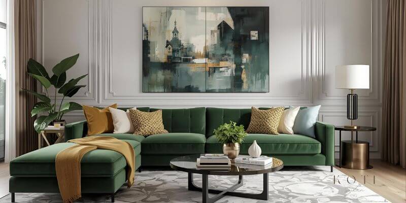
Combining colors successfully is not about finding the “perfect” shades.
It’s about understanding how colors relate to each other in a real space.
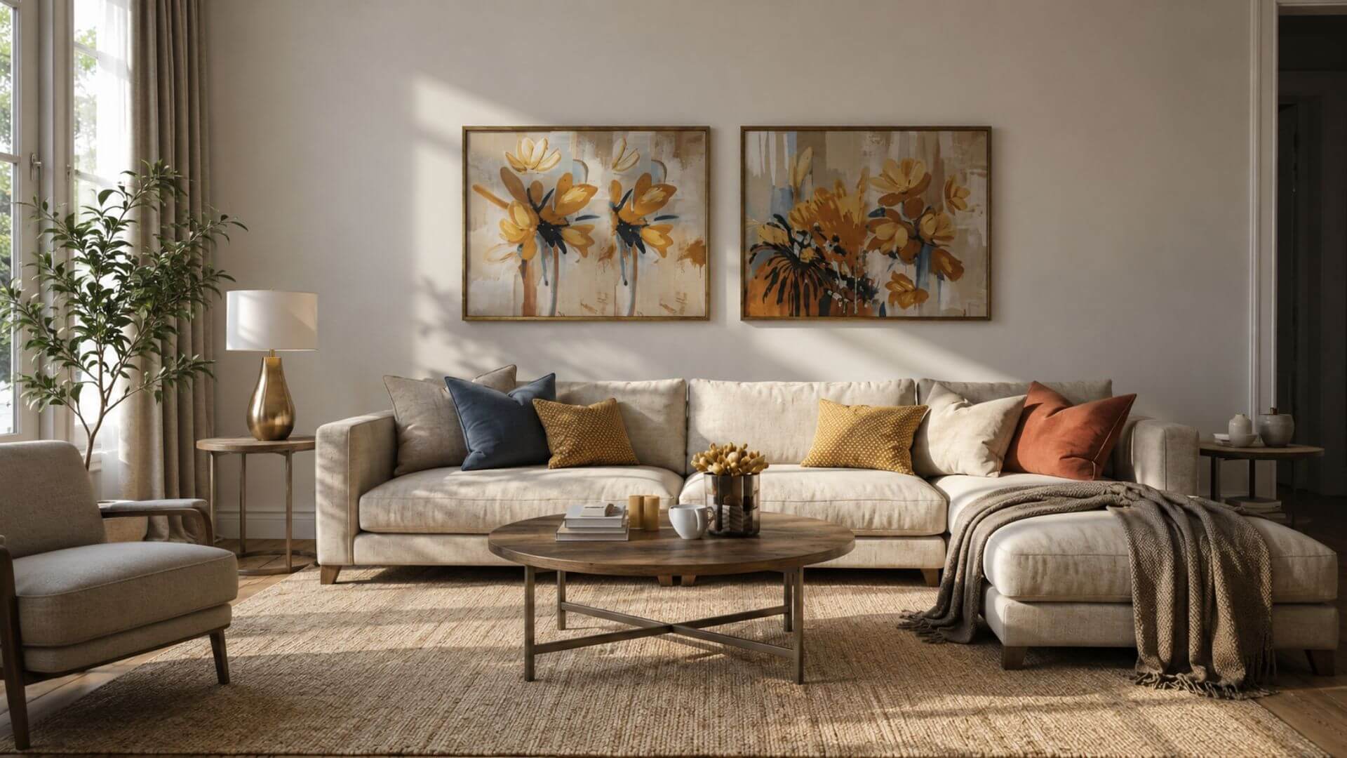
In this living room, the palette is built around a deep green sofa.
At first glance, the combination feels natural — but there’s a clear structure behind it.
The green acts as the main color, grounding the space and giving it a calm, natural base. Around it, softer neutral tones — like light gray, beige, and warm wood — create balance and keep the room from feeling too heavy.
A small amount of warm color, such as muted yellow or soft ochre, adds life to the space. It’s not dominant, but it changes how the whole room feels.
What makes this combination work
Nothing in the room is random.
Each color has a role:
- the main color creates stability
- the neutrals bring light and space
- the accent adds energy
Together, they create a balanced whole
A simple way to build your own palette
Instead of choosing colors separately, think in layers.
Start with:
- one main color (sofa, wall, or large element)
Then add:
- supporting tones that soften and balance it
Finally:
- one accent color that brings contrast and interest
Keep the palette limited.
Too many strong colors will break the balance.
The role of proportion
Even the best colors won’t work if the proportions are wrong.
A strong color used too much can dominate the space.
The same color used in smaller amounts can feel intentional and refined.
A simple guideline is:
- most of the room should feel calm
- a smaller part should add contrast
This keeps the space visually interesting without making it overwhelming.
The easiest way to avoid mistakes
If something feels off, it usually isn’t the color itself — it’s the intensity or the amount.
Try:
- softening the strongest shade
- reducing one competing color
- adding more neutral surfaces
Small adjustments often make a bigger difference than starting over.
The key idea
Color combinations don’t have to be complicated.
When you focus on balance instead of perfection, the result feels natural — and much easier to live with.
When Colors Clash – How to Fix an Unbalanced Room
Not every color combination works — even if each color looks beautiful on its own. Sometimes a room feels slightly off, restless, or visually heavy.
In many cases, the problem isn’t the furniture or the layout — it’s the relationship between the colors.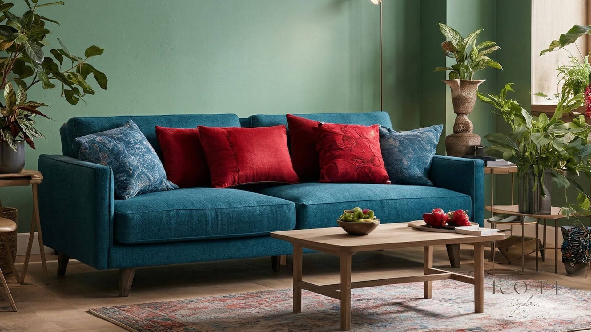
 softened, harmonious version.
When colors start to compete
In the first version of this space, the colors are strong and saturated:
- a deep blue sofa
- a bold green wall
- bright red accents
Each of these colors can work beautifully on its own.
But together, they create tension.
The eye doesn’t know where to rest.
Everything demands attention at the same time.
The result is visually striking — but exhausting to look at over time.
What changes in a balanced version
In the second version of the same room, the palette hasn’t changed completely — it has been refined.
The key difference is in the tone and intensity:
- the green wall shifts to a softer, muted shade
- the red accents become warm terracotta or brown tones
- the overall contrast becomes more controlled
The structure remains similar, but the feeling changes entirely.
The space becomes calmer, lighter, and more natural
Why small changes make such a big difference
Color harmony is rarely about replacing everything.
It’s about adjusting how colors relate to each other.
Even subtle changes can transform a room:
- slightly muted tones feel softer and more livable
- lighter backgrounds reflect more light
- natural materials reduce visual tension
Instead of removing color, you reshape it.
How to fix a room that feels “off”
If your space feels unbalanced, start small.
- Reduce the intensity of the strongest color
- Limit the number of bold tones used together
- Introduce neutral surfaces like beige, white, or soft gray
- Add natural materials such as wood, linen, or wool
These changes don’t remove personality — they bring clarity.
The key insight
Most color problems are not about “wrong colors.”
They are about too much intensity, too many competing elements, or lack of balance.
When colors stop competing and start supporting each other, the entire room changes.
Same colors — different relationship
What to take away from this
A well-balanced space doesn’t mean playing it safe.
It means understanding how to control contrast, soften intensity, and create flow.
Once you see that, you don’t need to start over.
You only need to adjust.
Final Insight – When Color Becomes a Feeling
Color is not just something you see — it’s something you feel.
It shapes how a space welcomes you, how long you want to stay, and how your mind settles when you walk in. The difference between a room that feels restless and one that feels right is often subtle, but powerful.
When colors are in balance, nothing demands attention.
Light moves naturally, materials come alive, and the space feels effortless.
That’s the moment when design disappears — and the room simply works.
You don’t need perfect colors.
You need colors that support each othe— especially in larger elements like sofas that define the entire room. See natural color sofas that bring this balance into your home.
.
And once you understand that, creating a harmonious home becomes less about rules — and more about intuition.
Not just a beautiful space but a place that feels like your own